Real life styled-components projects

There are so many ways to do styled-components. You might have seen developers online, debating on best styled-component practices or your colleagues all have different preferences for which convention is best suited for your project. After digesting all their opinions it’s easy end up even more confused.
You might have a background doing only SCSS, SASS, LESS or CSS modules… then you take up styled-components and it feels weird and you’re not sure you’re doing the right thing.
Or styled-components is your first CSS experience so it’s fine, but maybe you’re not sure that you’re missing out of some real life SC tricks or conventions that everyone uses.
That’s why it’s a really good idea to go out there and read the code of some real big open source projects that are already in production. In this article I’ll take Spectrum as an example. The other co-author of Spectrum is also the author of styled-components so naturally they use SC.
I skimmed through their source code and noted some of the conventions they’ve chosen…
###File Structure:
-
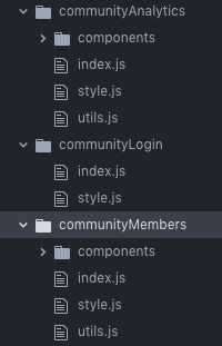
Most often styled components are kept in a separate file named style.js in the same folder as the React component:
 But sometimes the styled components are written in the same file as the React component. See fx. src/components/column/index.js
Other variations of this convention:
-
Here the styled components are defined above the component. Some prefer to keep the styled components below the React component to avoid having to scroll down to the React component when modifying it.
-
Another common convention is to either keep styled components in the same file as the React components OR in another file. Here that’s not the case - it’s a mix.
-
-
Here there’s a file src/components/global/index.js where recurrent elements and styling functions are kept together within the same file.
-
There’s a shared theme, that is kept outside of the src folder as it’s reused for the admin part of the project as well.
- Smaller components are together inside the folder src/components. Components like buttons
Other variation of this convention:
To store smaller components, like buttons.js, headings.js etc. together in folders named “UI” or “Shared”.
- Larger components are stored in a folder called “views” in src/views. Views are bigger components than those in the folder src/components. They’re a collection of many smaller React components/styled components, (some imported from src/components) that build up a view like a navigation bar, login view etc.
in a way, src/components is like a folder named src/shared or src/UI where there are all the smaller components that are being reused.
- There’s a reset.css file that uses the helper function
{ createGlobalStyle }from styled-components. (For those that don’t know, a reset file is used to reset all the predefined styles of a browser so that it becomes consistent between browsers).
###Naming conventions
- In the global.js file there are variables named P, H1, etc. But inside the style.js files, there are usually more descriptive names like fx. ThreadProfileCard
- The file where all the styled components are kept are generally called style.js,
Other variations of this convention:
styled.js -> Button.styled.js and the React component index.js -> Button.js
###Conditionals
Conditionals in dynamic styling systems can often become quite illegible and make us doubt that we’re applying the best practices. It’s reassuring finding this nested conditional in Spectrum’s code:
In these cases, some find it more readable to use helper functions that are kept just above the styled component.
###Style reuse:
-
Styles in aforementioned src/components/global/index.js are sometimes extended like this:
-
Styles are sometimes reused several times in different styled components within the same file. Here it’s in src/components/button/style.js to create various types of buttons within the same file.
- Within some style.js files there are styled components that are exported and then later used inside other style.js files that belong to other React components. Here’s an example inside of src/components/avatar/style.js borrowing styled component from : src/components/profil/style.js
- Style borrowings like right above don’t only take place between styled components: style.js ←→ style.js. Sometimes React components import from another style.js file that “belongs” to another component, fx: src/views/communitySettings/components/watercooler.js that imports styled components from src/components/settingsViews/style.js
So now we’ve gotten a some idea of how styled-components can be used in different ways. Other great open source projects are CodeSandbox and Atlassian that both use SC but both are more extensive projects than Spectrum. Skimming through their conventions and comparing to Spectrum can be useful to see what other practices exist out there.
Let me know if you’d like another article such as this, where I dive into CodeSandbox!


