
Reusable Media Queries with styled-components


Media queries are less popular than they were before as we now have more tools to achieve responsiveness, like Flexbox and CSS Grid. Despite that, media queries are still very useful, especially on a top level basis. They can become quite troublesome when your projects grow but those problems can be avoided.
If you’ve ever written media queries (especially if you’ve been using nonreusable media queries), following points could sound familiar…
-
You’re working on a big project, several people are working on it and the media queries have become a little inconsistent.
-
You’re doing mobile-up design…but you’ve accidentally started to mix min-width and max-width for no good reason.
-
Trying to remember what breakpoint you had decided on. Was it 66em or 68em? Checking in another file… hmmm.. where’s that breakpoint again?
-
Ah how’s the media query syntax again? Was it
@media min(400px)? Or was itmedia-min : 400px? or@media (min-width:400px)?… Look it up… loosing time -
Then changing your mind, no 70em would actually be the best fit. Which means you’ll refactor everywhere…in several files.
-
How was it again? Was 400px the smallest breakpoint or did I also have another smaller one?
What if you could make your media queries more…
-
verbose
-
readable
-
consistent
-
maintainable
-
DRY-er
And you can! Let’s find out how we can achieve this with styled-components.
So…
Let’s say we want to make a red box.

We’ll create a styled component of the width 200px. Let’s write this in some file, like index.js or App.js. Don’t worry, there’s a link to a sandbox project later on with the file structure and everything fully working.
const Box = styled.div`
  background-color: red;
  width: 200px;
  height: 200px;
`
Then lets define all the breakpoints of our breakpoints in ./mediaQueries.js, as here below. I just pick some random breakpoints but you can choose some that suit the design of your page. It’s nice to keep the names descriptive. You can name them whatever you want, like mobile, tablet, desktop etc.
You’d most probably want to choose breakpoints based on your design rather than different viewports of devices because today, devices can come in so many different sizes, and both landscape and portrait.
export const breakpoints = {
  sm: 20,
  md: 30,
  lg: 45,
  xl: 60,
}
Let’s say we’d like the box to turn green when the screen will reach 30em width:
import { mediaQueries } from "./mediaQueries"

const Box = styled.div`
  background-color: red;
  width: 200px;
  height: 200px;
  ${mediaQueries("md")`
    background-color: green;
  `};
`
I’ll show you the mediaQueries function later on. But isn’t that neat? Your editor is even going to suggest you what to take in as a parameter. Well it’s maybe not THAT thrilling but I’ve commonly seen another way of doing this that does not do autocomplete. This parameter hint can be very helpful when you’re writing a media query inside some file and you don’t want to have to go and look up the breakpionts in some other files. Take advantage of it, like this:
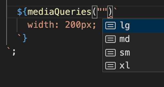
Isn’t this nicer using just plain media query? like this…
const Box = styled.div`
  background-color: red;
  width: 200px;
  height: 200px;
  @media (min-width: 30em) {
    background-color: green;
  }
`
Here there are no descriptive names, your breakpoints are not all in one place (DRY) and there will be no hints telling you which breakpoints you have already defined
All right, let’s take a closer look at the mediaQueries() function in ./mediaQueries.js
export const breakpoints = {
  sm: 20,
  md: 30,
  lg: 45,
  xl: 60,
}

export const mediaQueries = key => {
  return style => `@media (min-width: ${breakpoints[key]}em) { ${style} }`
}
—> In this example I’m using the em unit. That’s a scalable unit and is nice for accessibility but of course you could use fixed pixels units (px) if you prefer.
Here’s a sandbox example that you can play with, that also includes an example of what you’d do if you have some custom props like <Box width={400}/> and based on that props, you’ll want the box to become 400 pixels wide.
Keep in mind that in code sandbox’s IDE, you won’t necessarily have code autocompletion for the breakpoints, but you most probably will in your editor.
Adding typescript
export const breakpoints = {
  sm: 20,
  md: 30,
  lg: 45,
  xl: 60
};

export const mediaQueries = (key: keyof typeof breakpoints) => {
  return (style: TemplateStringsArray | String) =>
    `@media (min-width: ${breakpoints[key]}em) { ${style} }`;
};
and here’s the styled-component:
const Box =
  styled.div <
  Box >
  `
  background-color: red;
  width: 200px;
  height: 200px;
  ${mediaQueries("md")`
    background-color: green;
  `};
  ${props => mediaQueries("md")(`width: ${props.width}px`)}
`
See an example on code sandbox
Side notes
—> The reason for why there’s only min-width media queries, is that I’m imagining we’re doing mobile first design (mobile up). That means that we’re designing first for mobile and then for bigger and bigger devices. I think it’s a pretty effective way of designing applications because it tends to be more difficult to design for desktop and then going smaller. But you can adapt this example to your needs.
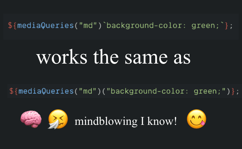
—> Why does this work? What are those “ backticks ?
${mediaQueries("md")`background-color: green;`};It’s what’s called a tagged template. It’s an advanced form of a template literal … You can read more about it here
Summary
Now you have some pretty clean global breakpoints, that you can use all over your project.
Benefits:
- Breakpoints are defined in only one folder
—> Which means easier maintenance / refactoring
- You have auto-completion + You don’t have to type out @media ( min-width … etc.) more than once
—> Which means you’ve got more time to do other stuff
- You can more easily decide on using only min-width (and not max-width)
—> More consistency
- Names are descriptive
—> Improved readability
Please let me know if you have some questions or comments :-)
Cheers!